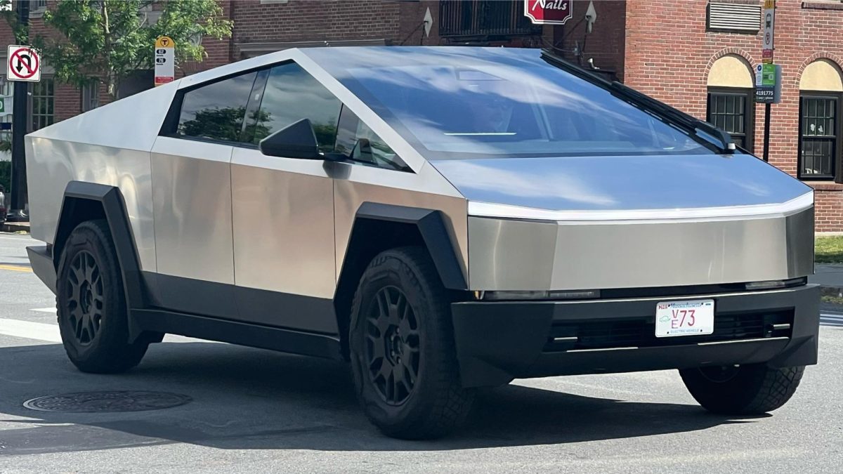
The Cybertruck is a good example of a bad design. Its minimalistic and futuristic appearance suggests desirable innovation, but it introduces significant safety concerns. The complete absence of knobs and buttons makes drivers heavily rely on touch screens. If using a phone while driving is unacceptable, how is a large tablet in the car any better? Traditionally, drivers would use muscle memory to navigate physical controls instead of being distracted from the road to look at a touch screen, ultimately increasing the chance of an accident. There is a reason why aircraft don’t follow such an “innovative” trend–physical buttons ensure safety through intuitive controls.
Not only that, the Cypertruck’s choice of material and sharp edges exacerbate the problem even further. The use of ultra-hard stainless steel reveals the designer’s prioritization of robust exterior over pedestrian safety. These exterior decisions raise questions about balancing the driver’s protection with the safety of those outside the car. The rapid acceleration that Elon Musk proudly points out should alert us: there is no reason for a massive vehicle to be able to go that fast. It is rather a downside. A rapidly accelerating steel angular-edged car that isn’t thoroughly tested presents another layer of risk on already unsafe California roads.
Its dysfunctional, yet exclusive design seems to attract wealthy individuals who seek ways to distinguish themselves from other drivers. The impractical design of the car brings controversy, increasing Elon Musk’s popularity. As the vehicle continues to receive public backlash, I can see how it might prompt changes in U.S. regulations to ensure the safety of drivers and pedestrians on the road. The impractical design replaces safety with minimalism, promoting misconceptions by fostering the idea that a tablet is inherently better than physical controls. On a larger scale, car companies might reevaluate and consider safer options that balance innovation and practicality.


